So you know how artist kinda have their "This is my peak best?" The "magnum opus" or something like that. I think this is it. It's a real bummer that it happens to be on a couple of walls, but, these things are pretty freaking amazing I think. Feel free to say otherwise, but I'll just delete you =P
Something I'm going to try and do from now on is name my colors so others can copy it if they like, and it also let's me refer back to my blog if I ever forget my color scheme. Now, I use Vallejo paints and I love them. The washes I use are GW. I'll mark any GW paints/washes whatever with a GW next to it. Assume Vallejo for anything else.
Aegis Walls/Turret and Turret Base:
Base Coat - Chaos Black GW Primer
Vallejo Paints
Undercoat - Heavy Green (Airbrush)
Top coat - Cayman Green (Airbrush)
Wash - GW Biel-Tan Green (Airbrush light/patchwork)
Wash - GW Agrax Earthshade (Airbrush lower half)
Drybrush - Mixed: Cayman Green and Desert Yellow
Drybrush - Desert Yellow
Emblems:
Undercoat - Heavy Warmgrey
Top Coat - Dead White [not sure if needed]
Top Coat - Ghost Grey
Wash - Mixed: Ghost Grey and GW Asurmen Blue [or equivalent]
Guns:
Undercoat - Boltgun Metal
Wash - GW Nulin Oil
Drybrush - Chainmail Silver
Ammo:
Undercoat: Tinny Tin
Top Coat: Hammered Copper
Wash: GW Leviathan Purple
Drybrush: Glorious Gold
A lot of paint now that I look at it. The airbrush was a life saver. I watched my friend Robert paint up some Aegis Defense lines by hand and it took him forever. I was able to get all of the basic airbrushing done in an hour. Really fast.
Something I learned while I was in Norway, that confuses me here. The GW guys here say "You don't need to mix anything with your washes, they work great out of the bottle. Don't listen to them. Yes, in a lot of cases this is a good thing. For the blue on the emblems though, it needs a bit of that Ghost Grey. It makes it less opaque I find and really helps it blend with the color underneath it. If you go with just straight up blue wash, it looks ugly. I tried it on one emblem and wasn't happy. So, mix a little, it isn't bad in some cases. It is in fact, a good thing.
And finally, the part that makes me go "squee" are the lenses on the gun. So this time I tried /really/ really hard to make them awesome as opposed to other times. I think I'm finally learning how to do it, and it really is just time and patience when you get down to it. All of the gem guides out there are absolutely right how to go about it, but it takes practice to figure it out. I could tell you the colors but that's silly. Again the guides out there have the colors, the trick is just the application.
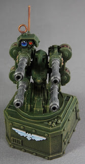
First, put your black down. Then work your way up from there. That's easier said than done really. Take a really fine brush and use your darkest blue to cover up most the black. Be sure to water it down a little, but cover up most of the black aside form a small bit at the top. Then gradually work your way towards your brightest blue. Have a bucket of water nearby, it's needed, because you will shake your brush often in it, grab a darker color, and redo lines in order to help it blend. That's all it takes. Just go back and forth slowly until you get the lense looking just as you desire.
Now, the reflection. A lot of people just use a white dot. I don't. For my red lenses I like to use yellow, while for my blue lenses I like to tint the white dot with a really light blue. I'll admit, I'm doing this wrong, but that's what you do. I'm a little scared to do it "right," let me explain.
Technically that "dot" is suppose to be the reflected color of the sky. Whenever you do highlights, you're suppose to, as far as I understand it, have a bit of color from the sky in your high light. The highlight is reflecting the light back at the user. So technically... all my lenses should have the same color dot in them whether that be blue or yellow. But anyhow, I never use pure white. I just don't like it. That extra bit of color means the world to me.
So yes! All done! I picked up this aegis defense line to have something easy to paint, and it really was a breeze. I also hoped to have something in the future to shoot fliers down with. This will let me do that, and look pretty freaking awesome as well! I really hope this helps some of you make some freaking awesome walls, and I think the same scheme can be used on the bastions unless you want to go with grey. Until next time!
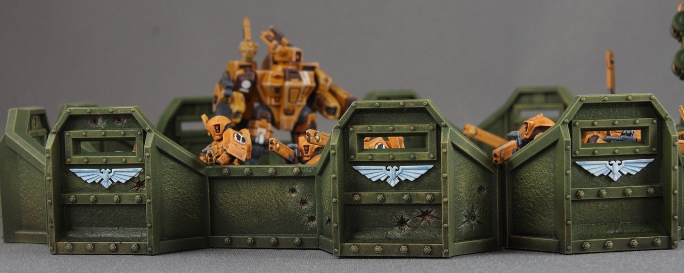


Those are amazing! I told you battle damage would be awesome! :)
ReplyDeleteHello! In this blog entry did you use the information from some researches or these are only your exclusive conclusions? Waiting forward to hear from you.
ReplyDeleteI'm a bit confused. Yes all the conclusions are my own, after having researched other techniques and trying to apply them. Example, the lenses stuff is easily gathered from an online guide. http://www.belloflostsouls.net/2012/06/hobby-painting-viewports-and-lenses.html I however came to my own conclusion. It was something I learned while taking art courses in college that the reflection is suppose to be the sky and never white.
DeleteWas there something specific you were referring too? The colors I chose was just me playing around with my paints to find what was right. I didn't use any ones defined color set.